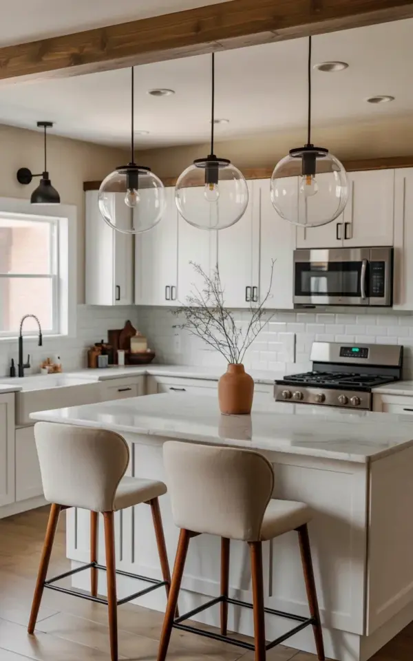
Honestly, I think kitchen island pendant lights are one of those details people either overthink or ignore completely. But look at a setup like this one. Three clear glass globes with black metal hardware hanging over a white marble island. It just works. That simple combination of glass and metal and stone does something to a room that no single fancy cabinet handle could ever do. And the best part? You do not need a designer to pull this off. You just need to know what to look for, and that is exactly what this article covers. This is your beginner-friendly walkthrough for pendant lighting that actually makes sense for your space.
Three Globe Pendants Over an Island. Why That Number Works.
I have seen kitchens with one giant statement pendant, and I have seen kitchens with five tiny ones crammed together. But three pendants, specifically clear glass globes, hit a sweet spot. There is a reason so many designers land on three as the magic number. It gives you balance without looking like a showroom floor. If your island is around six to eight feet long, three pendants spaced evenly let each one breathe while still creating a unified line of light.
The spacing matters more than you think. You want the globes to sit about 24 to 30 inches apart, measured from the center of each fixture. Not from the edge. That way the light spreads evenly across your marble counter without leaving dark gaps where nobody wants to chop vegetables. And honestly, that black hardware in this photo does a lot of heavy lifting visually. It anchors the glass globes so they do not float into the ceiling like lost balloons.
Clear Glass Globe Pendants Keep the Open Feel Alive
Here is the thing about clear glass globes. They disappear. Not literally of course, but they do not block your view across the kitchen the way a big metal drum shade would. That is a huge advantage in an open plan kitchen where you want the eye to travel from the sink to the range to the dining table without hitting a visual wall. The globes in that photo are simple, round, and transparent. They let the white marble island and the white shaker cabinets be the stars.
One concern people always bring up is maintenance. Fingerprints. Dust. The occasional splash from cooking. I am not gonna lie, clear glass does show smudges. But here is the trade off. Wiping a glass globe takes about ten seconds with a microfiber cloth. Compare that to dusting a fabric shade or scrubbing a metal one with special cleaner. Glass wins every time for real life. Also, you can use standard clear bulbs inside these globes or go with a warm Edison style if you want a bit of filament glow visible through the glass. Both look good. I personally prefer the clear bulbs because the modern kitchen in that photo asks for clean lines, not vintage flair.
White Shaker Cabinets and Marble. Why They Pair With Matte Black Hardware.
White shaker cabinets are basically the little black dress of kitchens. They go with everything. But pair them with white marble and you risk a room that looks sterile, like a lab where they make yogurt. So you need something to break up all that white. That is where the matte black faucet and the matte black gas range come in. They echo the black hardware on the pendant lights. The whole thing ties together without anyone having to shout about it.
And here is a random detail that struck me when I looked at this photo. The black gooseneck faucet over the farmhouse sink is positioned on the left side of the island. That is a smart move. It keeps the main prep area on the right clear for actual work. Little things like that make a kitchen feel designed, not just decorated. If you are planning your own remodel, think about where your faucet lands relative to your pendants. You do not want a faucet handle hitting a light globe every time you fill a pot. That would drive me nuts. Ask me how I know.
Kitchen Island Pendant Lights and the Tall Ceiling Problem
Ok so this kitchen looks like it has standard eight to nine foot ceilings. That is the most common scenario in regular homes. For that height, you want the bottom of your pendant globes to hang about 30 to 36 inches above the counter surface. That puts the light right where you need it without bonking you in the forehead when you lean over to grab a spoon. For higher ceilings, you can go a bit lower or use longer cords. The photo shows the globes hanging with a modest drop, nothing dramatic, just practical.
I will say this. If you have ten foot ceilings or higher, consider adding a swag hook or a ceiling medallion to keep the cords from looking stretched and sad. The black metal downrods in the photo look sturdy and intentional. They are short and thick, not long and spindly. That is a choice that makes the whole setup feel grounded. If you are shopping for pendants online, check the dimension on the canopy too. A tiny canopy above a big globe looks like a hat that does not fit.
- Measure your island length before buying anything.
- Center the pendants over the countertop, not the overhang where people sit.
- Use dimmable bulbs so you can shift from task lighting to mood lighting in one switch.
- Match the metal finish on your pendants to your faucet and cabinet hardware for a cohesive look.
- Do not forget to account for the width of the globe itself. Bigger globes need more space between them.
White Subway Tile Backsplash and Its Quiet Role in This Kitchen
The white subway tile backsplash in this photo is almost background noise. And that is exactly what a backsplash should be when you have pendants and marble island competing for attention. Subway tile is cheap, easy to clean, and timeless. It does not go out of style because it is not really a style to begin with. It is a material. This particular installation runs in a classic brick pattern, nothing fancy, no herringbone, no vertical stack. The simplicity lets the black gas range and the stainless steel hood stand out rather than fight for space.
If I had one minor complaint about this tile choice, it is the grout color. It looks like a standard white or off-white grout which will show stains eventually. I would have gone with a warm gray grout myself. But honestly, that is nitpicking. The overall effect is bright and clean and that is the whole point. The pendants above the island do not have to compete with a busy backsplash. They get to be the only sculptural element in the room, and that makes them more effective.
Mid Century Modern Bar Stools and How They Complete the Story
I almost missed the bar stools in the photo. They are tucked at the edge of the island with that mid century modern silhouette, thin metal legs and a simple seat. They are not screaming for attention either. But they matter because they introduce a second material, probably wood or a wood tone, into a kitchen dominated by white and black and marble. Without those stools, the room might feel a bit cold. With them, there is a human touch.
The light wood flooring also helps. It warms up the space from the ground up. And it creates a contrast with the white cabinets that makes the whole kitchen feel layered rather than flat. If you are starting from scratch, choose your flooring before you pick your pendants. The floor is harder to change than a light fixture. That is practical advice from someone who once fell in love with a pendant light only to realize it clashed with the existing floor. Do not be that person. Look at the whole room, not just the island.
A Note on Black Gas Ranges and Stainless Steel Hoods
The black gas range in the photo is a beast. It is heavy and serious and it sits there looking expensive. And yet it matches the black hardware on the pendants. That is a deliberate choice. If you have a stainless steel hood like this one does, you have to decide whether you want the range to match the hood or match the pendants. Here they went with black for the range and stainless for the hood. That is a valid compromise because the hood is so much higher up that your eye does not directly compare the two finishes.
By the way, that black over the range microwave mounted above? It is a rarity. Most over the range microwaves come in stainless or white. Finding one in black that coordinates with a black gas range is like winning a small appliance lottery. If you are shopping for this look, expect to search a little harder for that microwave. But it is worth the effort because it keeps the black thread running through the entire kitchen without introducing another random metal.
So to wrap this up. That photo of the three clear glass globe pendants over a white marble island is not just a pretty picture. It is a blueprint. A beginner can look at that image and understand exactly how to choose the number of lights, the finish, the height, and the surrounding materials. You do not need a degree in interior design. You need a measuring tape, a clear idea of what finishes you like, and the willingness to let the pendants be simple. Because sometimes simple is exactly what makes a kitchen feel finished.
If you are planning your own kitchen update, save this photo as a reference. Match the finishes, check the spacing, and buy quality dimmable bulbs. The rest will fall into place. And if you have questions about pendant height or which bulb shape works best for clear globes, drop a comment below. I read every single one.
#kitchen design #pendant lighting #white kitchen #glass globe pendants #modern kitchen
This post was researched and drafted with AI assistance, then personally reviewed and edited by Mia before publishing.
Leave a Comment