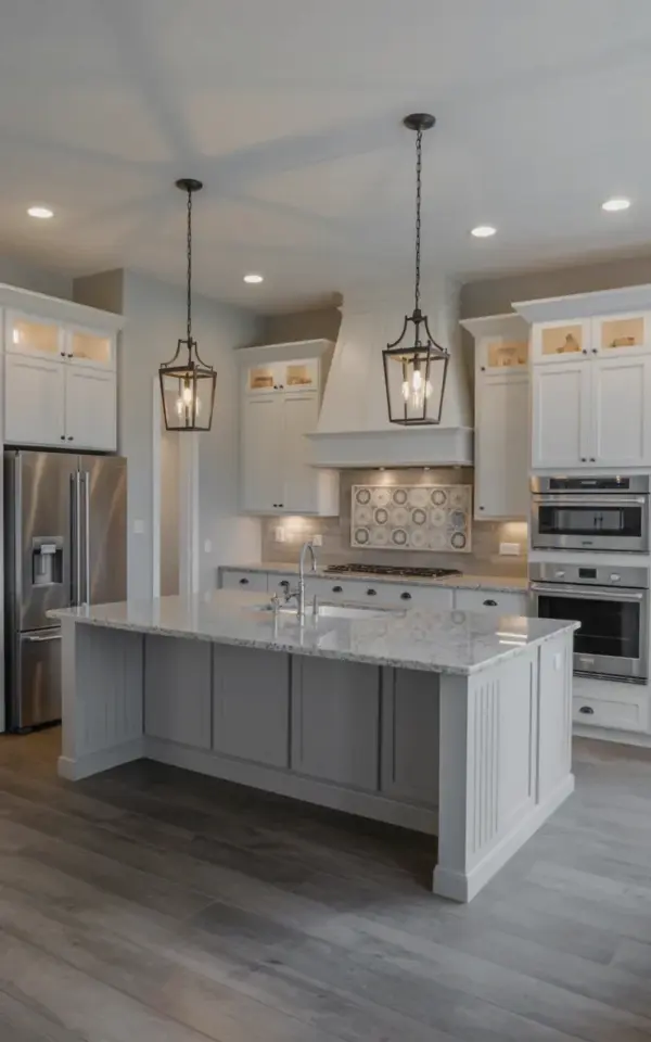
Honestly, this is the kind of kitchen that makes you stop scrolling. You see the white shaker cabinets, the soft gray island, and the black lantern pendants, and you just know the whole room feels different in person. For anyone tracking kitchen before and after transformations, this is a prime example of how a few smart choices can completely change a space. It doesn’t take a massive renovation budget to get this look, but it does take a solid plan.
This particular remodel is a masterclass in contrast. The bright white upper and perimeter cabinets open the room up, while the light gray island grounds it. Those three black pendant lights floating above the counter do more than just illuminate; they give the space a touch of modern luxury kitchen energy without trying too hard. And the backsplash? It pulls the gray, white, and beige tones together so nothing feels out of place.
I have a soft spot for white shaker cabinets because they age well. Trends come and go, but this style manages to look fresh whether you pair it with brass hardware today or matte black pulls five years from now. In this remodel, the classic door style lets the granite and tile do the talking. The cabinets are the reliable backbone, not the loud accessory. That is a hard balance to get right, and they nailed it.
### Why White Shaker Cabinets Are a Safe Bet for a Major Kitchen Remodel
If you are completely new to remodeling, you might not know why “shaker” is such a big deal. It simply refers to the door style, a five-piece design with a recessed center panel. It is clean, simple, and works with almost any handle you throw at it. For a beginner, it is the least risky choice because it does not force you into a specific era.
This kitchen proves that point perfectly. The white shaker cabinets act as a blank canvas. They reflect natural light, which makes the entire room feel bigger. That matters if you have a galley kitchen or a space that lacks windows. And visually, they hide messes better than a dark cabinet, which is a practical win for busy families.
Another reason this cabinet style dominates Pinterest is the cost. You can find affordable options at big box stores that still look high-end. The key is to spend your money on good hinges and soft-close mechanisms, not just the wood itself. Those small details make closing a drawer feel expensive, even if the door itself was budget friendly.
### The Gray Kitchen Island Effect: Adding Depth Without Going Dark
Painting your island a different color is one of the easiest ways to break up a white kitchen. This light gray island does exactly that. It adds a layer of sophistication and gives your eye a place to rest. It is the perfect middle ground between a stark all-white kitchen and a bold, moody one.
I love that they didn’t go too dark with the gray. A charcoal or black island can look dramatic, but it can also feel heavy in a smaller room. This lighter gray keeps the airy vibe intact while still providing that element of contrast. It is a softer, more approachable take on the classic two-tone kitchen.
When you plan your own island, think about the seating. This one has a flat overhang that is just begging for a couple of bar stools. That makes it functional for quick meals, homework, or casual conversation while you cook. Durable countertops are essential here. Since the island is where everyone gathers, you want a surface that can handle hot pans and the occasional red wine spill.
### How Black Pendant Lights Define a Modern Luxury Kitchen
Let’s talk about those light fixtures. The three black lantern pendants are not just a lighting source, they are the jewelry of the room. They draw your eye upward and add a vertical element that makes the ceiling feel higher. This is a classic move in modern luxury kitchen design.
Using black in small doses, like hardware and lighting, gives the space a crisp edge. It works beautifully against the stainless steel appliances and the cool gray tones. The clear glass shades allow the bulbs to cast a warm glow, which softens the overall look. If you use solid metal shades, you risk making the space feel too industrial.
A quick tip for hanging pendants over an island: keep about 30 to 36 inches between the bottom of the fixture and the countertop. This prevents the light from glaring in your eyes while you eat. It also creates a nice visual barrier between the cooking zone and the seating area.
### Practical Countertop and Backsplash Ideas for Your Kitchen Remodel
The countertops here are light gray granite. They match the island beautifully and add a subtle pattern that prevents the kitchen from feeling flat. Granite is a solid choice for beginners because it is tough and forgiving. Unlike marble, it does not etch easily when lemon juice sits on it, which is a huge plus for daily cooking.
Now for the backsplash, this is where personal taste really shines. The patterned tile in gray, white, and beige is a smart pick. It ties the cool gray of the island to the warm tones in the granite. If you use a plain white subway tile, the room might feel too sterile. This decorative tile adds texture and interest without overwhelming the space.
If you are on a budget, consider using this kind of patterned tile only. Just put it on the wall behind the stove and keep the rest of the backsplash simple. That creates a focal point while saving you money. And honestly, a little pattern goes a long way in a kitchen.
### The Role of Stainless Steel Appliances in a Bright, White Space
The stainless steel appliances in this photo are not an accident. They are a deliberate part of the design scheme. When you use white cabinets, you need a contrasting element at the floor level so the room does not look washed out. Stainless steel provides that anchor.
The KitchenAid refrigerator on the left blends in but still looks substantial. The built-in wall oven on the right is a game changer. It frees up space under the counter, which makes cleaning easier. Wall ovens are often set at a better height, so you do not have to bend down to check on a roast.
Here is something to think about if you are new to appliances:
– Mixing brands is totally fine, just try to match the finish and style.
– Built-in appliances look sleek but are pricier than freestanding ones.
– Stainless steel smudges, keep a microfiber cloth handy by the stove.
– Panel-ready appliances can hide behind cabinet fronts if you want a seamless look.
Getting that high-end look is about the details, not the logo on the oven door.
### White Range Hood and Ventilation Tips for a Cleaner Air Kitchen
You see that white range hood above the stove? It is actually a critical piece of the puzzle. Beyond the aesthetic, a range hood removes grease, smoke, and odors from the air. If you cook a lot of fried food or Asian cuisine, a strong vent is non-negotiable.
In this design, the white hood disappears against the white shaker cabinets. That is a clever trick. It keeps the cooking zone visually quiet so the black pendants and the island get all the attention. A lot of people choose stainless hoods, which are noticeable. But matching the cabinets creates a streamlined look that feels custom.
Make sure you vent to the outside if possible. Recirculating hoods just blow the air through a charcoal filter and back into the room. That is fine for small kitchens, but you lose a lot of efficiency. For long term happiness, a proper exterior vent is worth the extra installation cost.
### Bringing the Photo to Life in Your Own Home
If you are scrolling through Pinterest for kitchen remodel ideas, you might wonder if this look is achievable in a typical home. The answer is yes, if you plan ahead. This design does not rely on unusual dimensions or custom built-everything. You could recreate it in a standard suburban house.
Start by picking your cabinet color and sticking with it. White shaker cabinets are widely available at several price points. Then, choose your island color. A light gray paint like “Repose Gray” or “Agreeable Gray” by Sherwin-Williams works with a lot of different lighting conditions. I usually steer people toward warm grays, because cold gray can look sterile on a big surface like an island.
For the backsplash, search for “arabesque” or “zellige” tiles to find patterns similar to the one in this photo. They offer a modern look that feels handmade. Finally, do not forget the lighting. The right pendants transform a room from ordinary to collected. It is the easiest way to bring a little drama into your daily life.
Ok so, to wrap this up, this kitchen before and after shows the power of contrast. White cabinets open the space, a gray island grounds it, and black accents give it an edge. The materials are practical, the style is timeless, and the result feels welcoming. If you are planning a remodel, save this photo for reference. And if you end up using a similar palette in your own home, I would love to hear how the project turns out. Comment below and tell me what you decided on for your island.
This post was researched and drafted with AI assistance, then personally reviewed and edited by Mia before publishing.
Leave a Comment