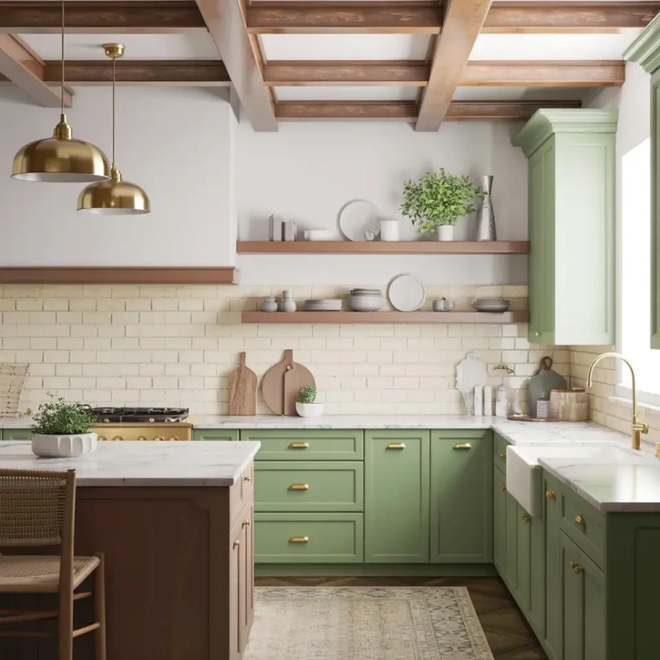
I love this modern farmhouse kitchen design, especially the sage green cabinets and marble countertops. But here’s the thing: most people mess it up trying to copy it on a budget. Look, I’ve seen kitchens that looked like a sad Pinterest fail because someone skipped a crucial step or went cheap on the wrong things. The beauty of this exact look – the warm beams, the brass pendants, the floating shelves – is that it’s totally doable without spending a fortune. You just have to know the common traps. So let me walk you through the biggest mistakes, and how you can dodge every single one.
Mistake #1: Buying Real Marble When You Don’t Need To
Real marble is expensive. It stains. It etches. It cracks if you look at it funny. Not gonna lie, I helped a friend install a marble slab once and we both regretted it within a month. For a budget farmhouse kitchen, go for a high-quality quartz with a marble look, or even a porcelain slab. That white marble countertop in the photo? It’s almost certainly not real stone. The key is to pick a pattern with subtle veining, not crazy dramatic swirls. Anything too loud screams fake. And save yourself the nightmare of sealing – quartz doesn’t need it.
Mistake #2: Ignoring the Ceiling (But Exposed Beams Are a Game Changer)
Those warm brown wooden beams in the photo are what make the space feel cozy, not just another kitchen. Most people think adding beams means hiring a carpenter for thousands. Wrong. You can do faux beams with lightweight polyurethane that look exactly like real wood. Paint them a warm brown tone, not too dark, not too red. Honestly, I’ve seen a ceiling go from boring to stunning in an afternoon with a couple of hollow beams and some construction adhesive. This is the kind of upgrade that impresses everyone who walks in, and it costs less than a good dinner out.
Mistake #3: Picking a Backsplash That Fights the Cabinets
The backsplash in the photo is light beige marble tiles. It’s subtle, it’s not competing with the sage green. Here’s the mistake: people choose a backsplash that’s too busy or too dark. They think subway tile is the only budget option. But you can get marble-look ceramic or porcelain tile for a fraction of the price. Stick to a soft neutral, maybe with a matte finish. Avoid glossy – sage green cabinets already have a beautiful finish, you don’t need extra shine. And for heaven’s sake, don’t use peel-and-stick if you want it to last more than a year. I tried that once, it bubbled up behind the stove within months. Not cute.
Mistake #4: Using Builder-Grade Lights Instead of Those Brass Pendants
Two brass pendant lights hang from those beams in the picture. That’s not an accident. The warm brass adds elegance without being showy. But I see so many people buy the cheapest flush-mount light they can find and call it a day. Big mistake. Lighting is the jewelry of the kitchen. You can find brass pendants at secondhand stores or online for under fifty bucks each, just spray paint the chains if needed. And here’s a weird detail: I once spent an hour measuring the height of my pendants only to realize I hung them too high. They should hang low enough that you see them in your peripheral vision, not lost up near the ceiling. Judge the height by the beams – roughly a third of the way down from the ceiling to the countertop feels right.
Mistake #5: Forgetting How Floating Shelves Actually Work (Storage Wise)
Those two floating wooden shelves in the photo hold white ceramic dishes and a green plant. They look effortless. But people screw them up by overloading them. Here’s the thing: floating shelves are not for your ugly Tupperware or your spice jars with mismatched lids. They are for display. Use them for items you actually want to see – nice bowls, a plant, a cookbook. The biggest mistake? Installing them crooked. Use a level, people. I’ve seen shelves that look like they’re trying to escape the wall. And go for a medium brown wood tone to match the beams. Not too dark, not too light. If you’re on a budget, you can make your own from a pine board and some brackets – easy DIY, seriously.
Also, don’t cram them shelf-to-shelf with stuff. Leave breathing room. A little empty space makes the kitchen feel bigger and more intentional. That’s not just design advice, that’s life advice.
Mistake #6: Choosing the Wrong Shade of Sage Green for Your Cabinets
Okay, so sage green cabinets are the star of the show. But there’s a fine line between perfect sage and something that looks like hospital scrubs or baby poop green. I know, gross but true. The trick is to test your paint in natural light. The photo shows a muted, slightly grayish green – not too yellow, not too blue. Get a sample pot and paint a large piece of foam board. Move it around your kitchen at different times of day. I did this and ended up choosing a different shade than my favorite swatch. Trust the process. Affordable cabinet paint exists – look for a high-bonding primer and a durable topcoat. Don’t skip sanding and cleaning the cabinets first, or the paint will peel. That’s mistake 6.5, but I’m lumping it in because it’s that important.
Mistake #7: Ignoring the Island Shape and Color
The kitchen in the description has a large L-shaped island with a dark brown countertop (or base, not totally clear). The mistake people make is either making the island too small, or picking a countertop that clashes with the marble. An L-shape is a bold choice, but it works because it creates workspace and seating. If you’re on a budget, you can paint an existing island a darker tone, or even use butcher block for the countertop. Dark brown adds warmth without competing with the sage green. Just don’t make it the same color as the cabinets – you need contrast. And honestly, an island doesn’t have to be huge. A narrow cart can work wonders if your kitchen is small. The point is to have a central surface that anchors the room.
And one more thing about islands: people forget to put an outlet on the end. So if you ever want to plug in a laptop or a phone while sitting at the island, you’re stuck. Add one during the reno. Future you will thank me.
Look, recreating this modern farmhouse kitchen on a budget is totally realistic as long as you avoid these seven mistakes. Start with the cabinet paint, a marble-look backsplash, and some secondhand brass pendants. Save the big splurge for something like the quartz countertop or the beams if you really want. But don’t let perfectionism stop you – half the charm is in the imperfections anyway. That slightly off-center shelf? Character. The hand-painted beams? Conversation starter.
Pin this for your kitchen reno checklist. And when you do start, send me a picture. I’d love to see your sage green cabinets in the wild.
#modernfarmhouse #sagegreencabinets #budgetkitchen #farmhousestyle #kitchenreno
This post was researched and drafted with AI assistance, then personally reviewed and edited by Mia before publishing.
Leave a Comment