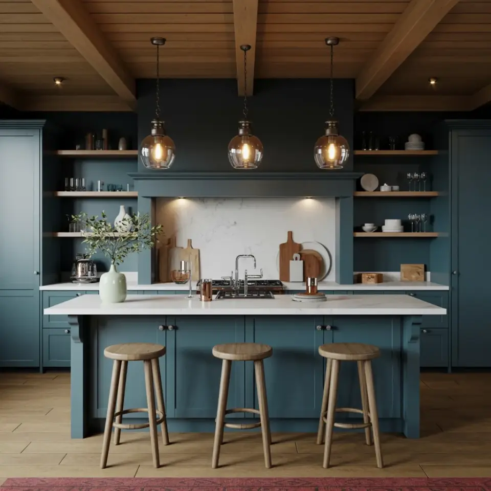
If you have ever tried to pick a bold kitchen color palette, you know how quickly excitement can turn into regret. A deep teal on the cabinets, a punchy orange backsplash, and maybe some neon yellow accessories. Suddenly the room feels chaotic instead of curated. The truth is that bold kitchen color palettes are not about adding every saturated tone you love. They are about making intentional choices that let each color breathe. I have painted a lot of rooms, and I have made nearly every mistake you can imagine. This guide walks through the most common pitfalls and shows you how to avoid them so your whole house feels connected, not disjointed.
Overloading the Kitchen with Too Many Saturated Tones
The easiest mistake is thinking that bold equals busy. You take a vibrant red for the lower cabinets, a deep navy for the upper ones, and a bright mustard for the island. Three bold colors in one room can work, but only if you introduce enough neutral space. Without white, cream, or wood tones to rest the eye, the kitchen starts to feel like a carnival.
A better approach is to choose one dominant saturated color and use it on the largest surface, usually the cabinets or the walls. Then bring in a second bold shade on a smaller element such as the island or the backsplash. Keep the third accent very restrained, maybe a single piece of art or a set of barstools. This way the bold kitchen color palette feels powerful without overwhelming.
Ignoring Flow Between Rooms
You spend hours perfecting a bold kitchen, but then you walk into the living room and the paint suddenly feels disconnected. This happens when people treat each room as a separate project. A whole house paint scheme should have a thread that ties the spaces together, even if the colors are wildly different.
One simple trick is to repeat at least one hue from the kitchen in the adjacent room, but in a softer value. For example, if your kitchen uses a deep eggplant purple on the lower cabinets, paint the entryway or living room a pale lavender on the walls. The connection is subtle but deliberate. You can also use a consistent trim color throughout the house. White trim in every room creates a visual anchor that lets bold kitchen color palettes stand out without clashing with the rest of the home.
Forgetting About Lighting and Undertones
A vibrant coral that looks amazing under the showroom lights can turn into a sad pinkish gray in your north‑facing kitchen. Undertones are the silent killers of bold paint schemes. Every saturated color has a hidden base (blue‑based reds, green‑based yellows, warm oranges) that interacts with natural and artificial light.
Before you commit to any bold kitchen color palette, paint a large swatch on foam board and move it around the room at different times of day. Look at it in morning sun, afternoon shade, and under your kitchen lights. If you notice an undertone you do not like, adjust before you buy gallons of paint. I once ignored a slight green undertone in a deep navy and ended up with a kitchen that looked like a sea captain’s quarters. A quick switch to a navy with a violet undertone fixed everything.
Using Color Blocking Without a Focal Point
Color blocking is a fantastic way to add energy to an entryway or living room, but without a clear focal point the blocks compete. You might paint a vertical stripe of bright yellow next to a square of dark charcoal and then wonder why the room feels unsettled. The problem is that each color block demands equal attention, and the eye has nowhere to rest.
Start with one large block that covers a main wall or a significant architectural feature, like a fireplace surround or a stairwell. Then add smaller blocks that are subordinate in size and intensity. For a color blocking idea that works, try using three rectangular blocks of paint on a long hallway wall. Make the middle block the boldest hue and the outer blocks a muted version of the same tone. This creates a natural rhythm and guides the eye through the space.
Pairing Soft Palettes with Modern Vibrant Paint the Wrong Way
A lot of homeowners want the best of both worlds: a soft, calming bedroom but a vibrant, punchy kitchen. This can be done beautifully, but only if you choose the right family of colors. For example, a soft blush in the bedroom pairs well with a deep fuchsia in the kitchen because they share a pink base. On the other hand, a cool sage green in the living room next to a hot orange kitchen usually feels jarring.#BoldKitchenColors #ColorPalettes #WholeHousePaint #KitchenDesign #ColorHarmony
This post was researched and drafted with AI assistance, then personally reviewed and edited by Mia before publishing.
Leave a Comment